
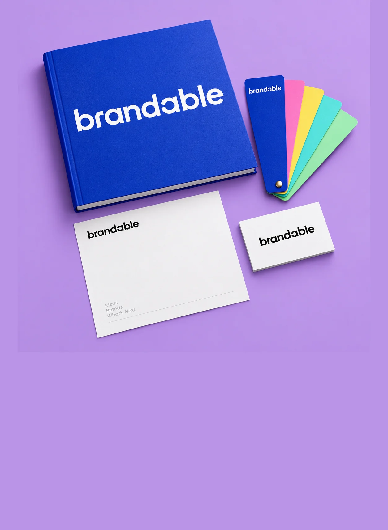
The best business card for a designer or creative makes the work easy to find. Prioritize a readable name, a clear discipline or role, and a portfolio address. Then choose a stock and finish that support your visual identity, whether that means understated matte or selective spot UV.
Treat your own card like a design brief.
Start with the impression you want someone to keep after the conversation. A restrained identity may need little more than careful type and space. An illustrator may want a distinctive image. A photographer might use a crop that represents the work they want to be commissioned for. None of those approaches requires turning the card into a complete portfolio.
Write down the one action the card should support. If you want someone to review your work, make the portfolio address easy to spot. If you are meeting collaborators, a clear role and email may do more work than an ambitious tagline. Let the action shape the hierarchy before you add decorative details.
Consistency matters more than squeezing every brand asset onto a small surface. Use the same name, tone, and visual language people will encounter online. Someone who moves from the card to your portfolio should feel that they have arrived in the right place. That continuity is especially useful when your studio name differs from your personal name.
- Choose one primary action for the reader.
- Show the work you want to do more of.
- Keep the card and portfolio recognizably connected.
Choose the finish after the idea.
Stock and finish change how a design feels, but they should serve the concept. Matte is a straightforward starting point when typography and layout lead the design. Soft touch silk offers a different tactile surface. Ultra-thick stock emphasizes the physical object. Selective spot UV can draw attention to a shape or part of a mark through the contrast between reflective and less reflective areas.
Think about the complete combination rather than a finish in isolation. A busy image, a small wordmark, and several special effects can compete for attention. One controlled treatment often gives the important element more space. If the appeal depends on how light moves across the surface, ask about a sample; a screen mockup cannot reproduce the physical experience.
Check exactly what is included in the selected product and variation. Gold-looking artwork does not mean a gold-foil process is included, and standard spot UV should not be assumed to have the same height as a raised coating. Confirm stock, coating, printed sides, and any additional artwork requirements before finalizing the design.
Compare the business card collectionGive your portfolio a clear way in.
Your card can show a hint of your work, but the portfolio does the deeper explaining. Use a destination you control and can keep current. A short, readable URL is often easier to understand than a line of social handles. If your site has several disciplines, choose a landing page that matches the kind of conversation you are having.
A QR code is an option, not a substitute for a usable destination. Check that the page works on a phone and loads the relevant work without an unnecessary sign-in. Test the code at the final physical size, with the intended contrast and surrounding space. Keep a readable address on the card so there is another route if scanning is inconvenient.
Select imagery with the finished card in mind. Details that look rich on a large monitor can become unclear at business-card size. Make a paper mockup and hold it at a natural reading distance. If the card depends on reading tiny text or understanding an intricate image, simplify before you commit to production.
Prepare artwork that survives the jump to print.
Use the template and specifications for the actual product you choose. Extend backgrounds into the required bleed and keep important information inside the safe area. Do not reuse dimensions from a different printer or assume every finish uses the same artwork setup. Rounded corners, for example, change how close a detail can sit to the edge visually.
For a selective coating such as spot UV, ask for the required mask format and setup instructions. The coating area and the printed artwork need to align. Keep the effect intentional and check whether very fine lines or small details are suitable for the process. The product specification should decide the setup, rather than a generic export preset.
Review the proof for more than spelling. Check the correct portfolio address, email, orientation, front-to-back relationship, and any coating instructions. If you are ordering for a show, client meeting, or portfolio review, confirm production and delivery separately. A useful business card is one that represents your work accurately and reaches you in time to use it.