
Client story / Sketch My Roof
Big presence.
Zero blending in.
A bold new look for a property intelligence company with a big moment ahead. Conference banner design for Sketch My Roof, by I Love Brandable.
Make my brand stand out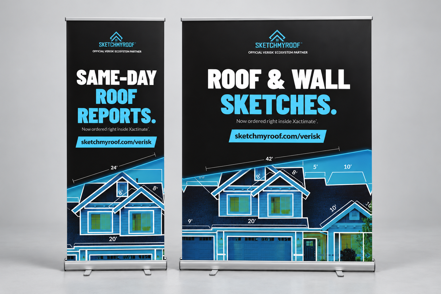
- Client
- Sketch My Roof
- Industry
- Insurance / Construction
- The occasion
- Gold sponsor / JCEA conference
- What we made
- Conference banner design
01 / The brief
A big moment deserves a bold introduction.
Sketch My Roof provides roof and wall measurements for the insurance and construction industries. Ahead of an upcoming Joint Claims Executive Association conference, where the company is a Gold Sponsor, its team enlisted I Love Brandable to redesign its smaller banners.
The direction was clear: make the brand feel bold, striking and full of personality. Give the service a strong visual presence and make the message easy to take in as people move through a busy conference space.
We brought that direction into a coordinated banner presentation, pairing the standard retractable format with a five-foot-wide display. Different footprints. The same confident identity.
The brand direction
Bold.Edgy.Personality.
02 / The design
Built to catch the eye. Clear enough to keep it.
The design puts the service, the brand and the next step in a clear order. Every element has a job.
A message with weight.
Oversized headlines put roof and wall reports at the center of the conversation. Short wording gives the service room to speak.
Color with conviction.
Electric cyan against deep black brings contrast and energy. White type keeps the main message crisp, while the house graphic connects the design to the work.
One clear next step.
A bright cyan website strip gives interested visitors an obvious place to go. The repeated layout connects both banners into one recognizable set.
03 / The finished direction
Two formats. One unmistakable brand.
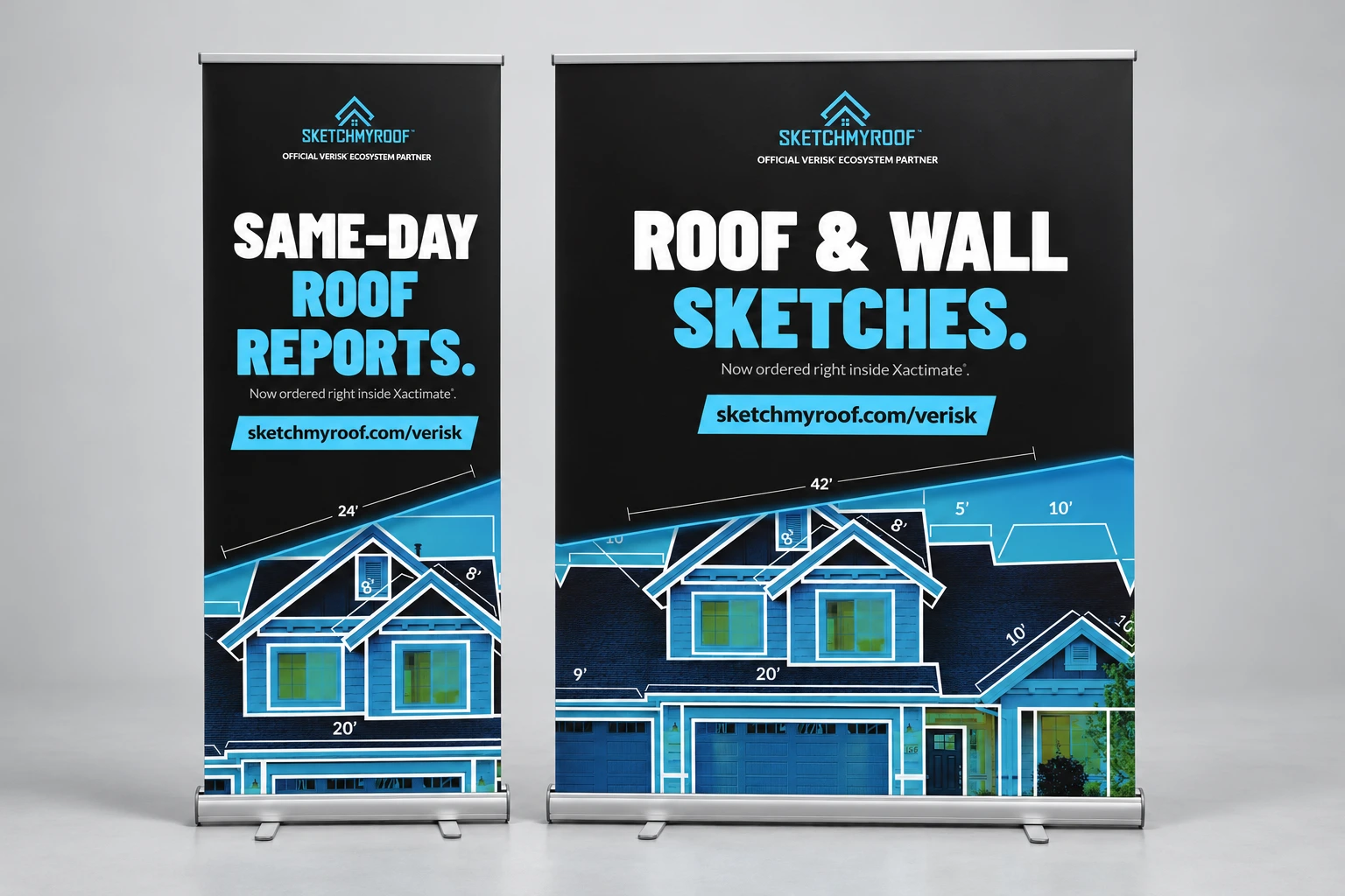
The finished design carries Sketch My Roof’s personality into both a compact display and a larger conference presence. Strong type, bold color and a consistent visual language give the team a coordinated way to show up for its upcoming event.
33″ × 80″ standard display. 60″ × 80″ five-foot-wide display.
Your brand could be next
Big brand energy. Clear prices.
Start with custom artwork, choose your display, and give your next event something worth looking at. Design and printing are priced separately.
Custom banner design
$97design only
A banner made for your brand. Tell us about your business, your message and the format you need.
Design only. Printing sold separately.
Premium retractable
From$202banner + stand
33″ × 80″. Full-color banner with our premium retractable stand and travel bag. A compact footprint with plenty to say.
$20 UPS Ground per US order.
Choose my premium bannerPrinting prices cover the selected banner and stand. Custom design is separate. Product pages show current options, shipping and production timing. You approve your print proof before production.
Have a big moment coming up?
Bring your brand, your event and your ideas. We’ll help give them a presence.