
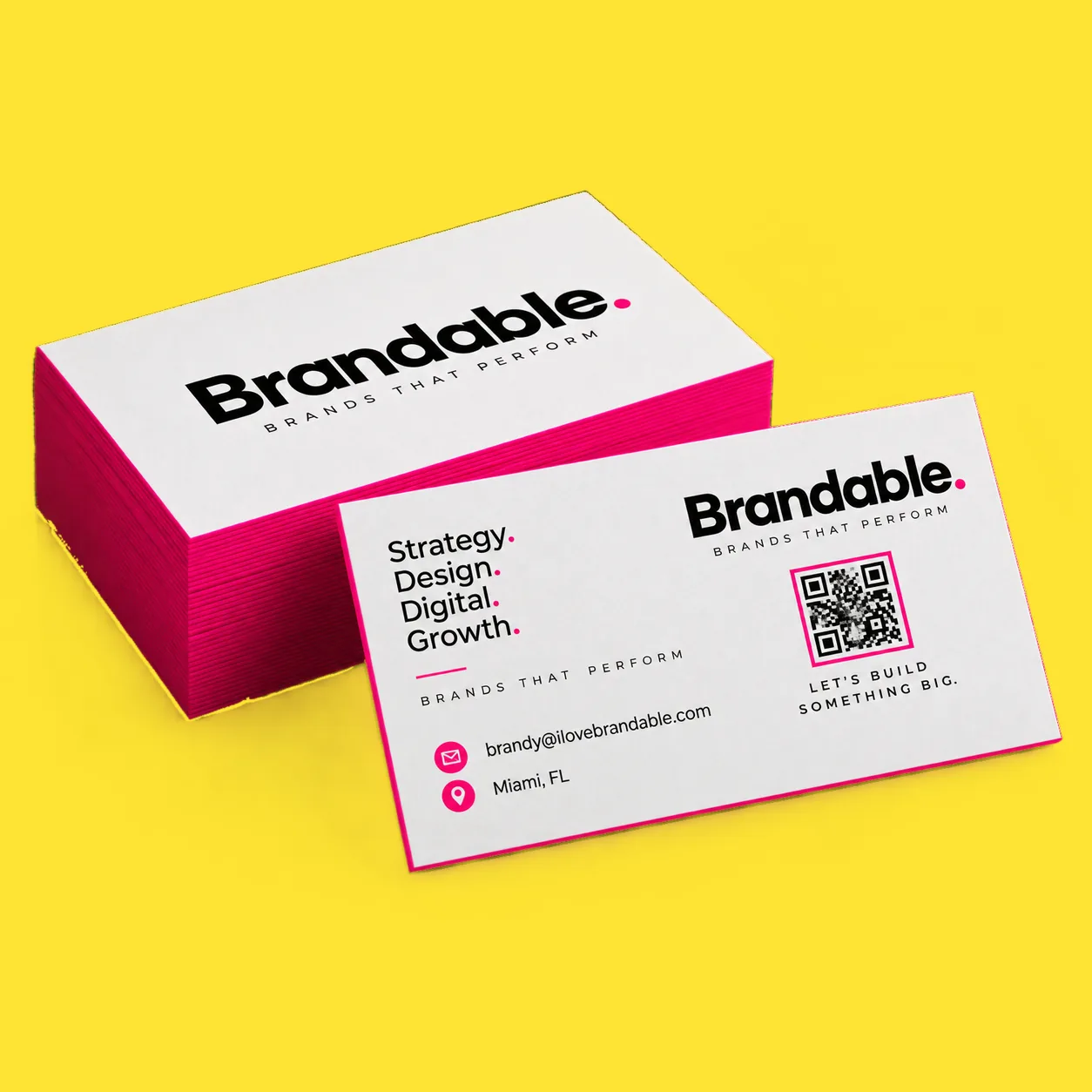
The ideas that survive contact with a press are the ones that change the object rather than the artwork: a painted edge, a raised gloss on one shape, a soft laminate, double thickness, or a rounded corner. Each one is a normal card with one decision made deliberately.
Change the edge, not the layout.
A painted edge puts colour on the cut side of the card, so it reads as a coloured stripe when the cards are stacked and as a thin line when one is held. It prints on 32pt uncoated stock, twice the usual thickness, which is what makes the edge wide enough to see at all. Sixteen paint and metallic colours.
Double thickness on its own does plenty. A 32pt card has a visible white edge and real weight, and it works best with a simple face: one mark, one line, and space around them. A thick card cannot rescue small type.
Neither idea needs anything unusual in the artwork. You design a normal card and the object does the work, which is why these two are the most reliable ideas on the list.
- Painted edge: 32pt uncoated, sixteen edge colours.
- 32pt plain: double thickness, visible white edge.
- Both print from an ordinary card file.
Put the shine in exactly one place.
Spot UV is a clear raised gloss applied only where you choose, so a logo or a single line catches the light against a flat surface. It goes on both sides, and it is the one idea here that needs a decision in the file: the gloss lives on its own layer, or as a separate black and white file where black means gloss.
It fails in a predictable way, so it is worth knowing. The gloss is applied in a separate pass off the press, which means type under 8pt, thin lines and fine serifs will not hold their shape in it. One hero shape works. Gloss over a paragraph does not.
On a soft touch card the same idea reads differently again: the raised gloss against a suede surface is a bigger contrast than gloss against gloss, and it can sit on an unprinted area as a ghosted shape.
See the spot UV cardIdeas people notice with their hands.
Soft touch is a 1.5 mil silk laminate on both sides of a 16pt card. It feels like suede rather than paper, colours look deeper under it, and dark designs benefit most. It is the idea that gets commented on without anyone knowing why.
Rounded corners cut a quarter inch radius off all four corners. It is a small change that reads as considered, and it wants a full bleed background rather than a printed border, because a border shows every tiny shift in the curve.
A matte card is the quiet idea on the list and often the right one. It takes a pen, which matters more than it sounds if people write appointments on your card, and it keeps attention on the typography instead of the finish.
- Soft touch: 1.5 mil silk laminate, both sides.
- Rounded corners: quarter inch radius, all four.
- Matte: writable, and kind to type.
The four things that make any of it work.
Keep text and logos an eighth of an inch inside the trim, and run backgrounds an eighth of an inch past it. That single habit fixes most of what goes wrong on a card, whichever idea you pick.
Build in CMYK at 300 dpi at final size. A screen is RGB and a press is not, so a colour that glows on a monitor can print flat and disappointing. We show you a proof before anything prints, and that is where this gets caught.
Send both sides as two pages in one PDF, front first. And if you need cards for several people, up to four versions of one design go in a single order as one file with one proof, which is cheaper and faster than four orders.
The artwork guide on any card page