
Printing for the way San Francisco does business.
San Francisco is technology and finance in a very small space, and the card that survives here is the one with the fewest words on it.
San Francisco packs venture capital, software, biotech across the bridge, a financial district and a food culture into forty-nine square miles. Business is dense and fast, meetings are short, and a card usually goes from a hand to a phone photo in the same minute. The Mission, Hayes Valley and the Marina carry the shops and restaurants; SoMa and the Financial District carry the offices.
Print in San Francisco should be minimal and considered. A matte card with a name, a role and one way to reach you. A postcard for a restaurant or gallery with a single image. Flyers for events still matter in the neighbourhoods, where a poster on a lamppost or a coffee shop board can fill a room.
Where print earns its keep in San Francisco.
Print works differently in different parts of a city. These are the places in San Francisco where a printed piece tends to do the most work, and the piece that usually suits each one.
SoMa and the Financial District. Tech and finance. Minimal cards, one colour, a finish that feels expensive.
The Mission and Hayes Valley. Restaurants, boutiques and studios. Postcards and flyers with real design.
The Marina, Cow Hollow and Noe Valley. Neighbourhood businesses and practices. Rack cards, postcards and door hangers.
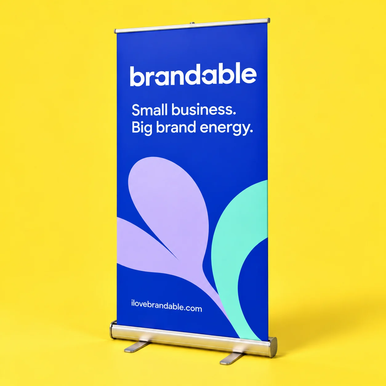
Moscone Center. The biggest tech shows in the country. A retractable banner and a sales sheet for a booth that has to look right.
One clear purpose. The right piece of paper.
What San Francisco tends to order. South San Francisco and the life sciences corridor across the bridge support a biotech supply trade that runs on a trifold brochure or sales sheet listing real specifications, apart from the minimal aesthetic the tech side prefers. San Francisco is also home to a dense concentration of philanthropic foundations and nonprofits, and that world tends to print a plain sales sheet or trifold brochure for a grant meeting rather than anything branded. Around Fisherman's Wharf and Union Square, rack cards and postcards aimed at visitors do steady work a phone itinerary does not replace.
Put a readable name first, then one line about what you do, then the one contact route you want people to use. A finish should support that, never make it harder to read.
Compare business card finishes| The moment | What usually works |
|---|---|
| A conference at Moscone | A retractable banner, booth cards and a sales sheet |
| A funded startup printing its first real cards | Business cards for the team, one file |
| A restaurant opening in the Mission | Postcards and rack cards from opening night |
| A practice in Noe Valley | Rack cards and a neighbourhood postcard drop |
Make the whole set feel like your business.
A San Francisco note. San Francisco design is spare to the point of austere, and print should follow. Matte or soft touch, small type, generous margins. If you add one thing, make it a painted edge or a single spot UV mark. Nobody here has ever been impressed by a card with a lot going on.
A brand does not need every piece to look identical, only a consistent voice, a deliberate palette and type that works at several sizes. Bring your logo, or start from nothing: print product design is $97 and logo design is $250, set up for the product and finish you picked.
See what design costsPlan around the day you need it in hand.
Work backward from the day the materials have to be ready, and leave room for artwork, the proof, production and shipping. Each product page states its own time on press: two to three business days for most cards and postcards once you approve your proof, three to four for soft touch and door hangers, seven to twelve for the XL banner. Shipping sits on top of that. Give us the delivery address and your date when you order, with a receiving name if it is going to a venue, a hotel or a shared office. If the date is fixed, say so and we will tell you whether it is possible before you pay.
Getting print into San Francisco. San Francisco's hills mean a delivery address can be a steep, one-way block from where a vehicle can actually stop, so a building on Telegraph Hill or Russian Hill can take longer to reach than the straight-line distance implies. The city's fog and damp air are a year-round condition rather than a seasonal one, and stock left on an exposed step can pick up moisture faster than in a drier climate. Many older buildings have no loading dock at all, only street parking that is often full.
Mailing in San Francisco. For postcards by route, Noe Valley, the Inner Sunset, Bernal Heights and the Marina are neighbourhoods where a mailer reaches households rather than office towers.
Give the file your full attention.
Use the artwork guide on the product you picked, because the finished size, the bleed and the safe area are not the same for every format. Upload a PDF, PNG or JPG and the size, bleed and resolution are checked in your browser, then your proof arrives by email and nothing goes to press until you approve it. Read your own details out loud when it lands: names, numbers, web addresses, dates, spelling and which side is which. If there is a QR code, scan it yourself.
See the artwork guide on a product